

X-Series Rally Flag Concept
Project Description
One of the projects I had the joy of working on while at Apex, was a new-to-the-world window design that incorporated cutting-edge polymers, art-deco inspired designs, and the latest in glass technology. It was called X-Series. We worked on developing the project over several years, and it took us to the largest fenestration show in the world, held in Nuremberg, Germany. We met with several manufacturers and suppliers, and identified the key players it was going to take to bring this product to market. We were coming down to the final stretch and just needed an American fabricator to assemble the window for us here in the States. Heavily inspired by a few key rally cries from critical moments in history, I designed a two-sided flag to represent our willingness to unite, and make X-series a reality.
Work Performed
- Conceptual Direction
- Graphic Design
Client
Apex Energy Group (Employee)

The Jolly Roger Concept
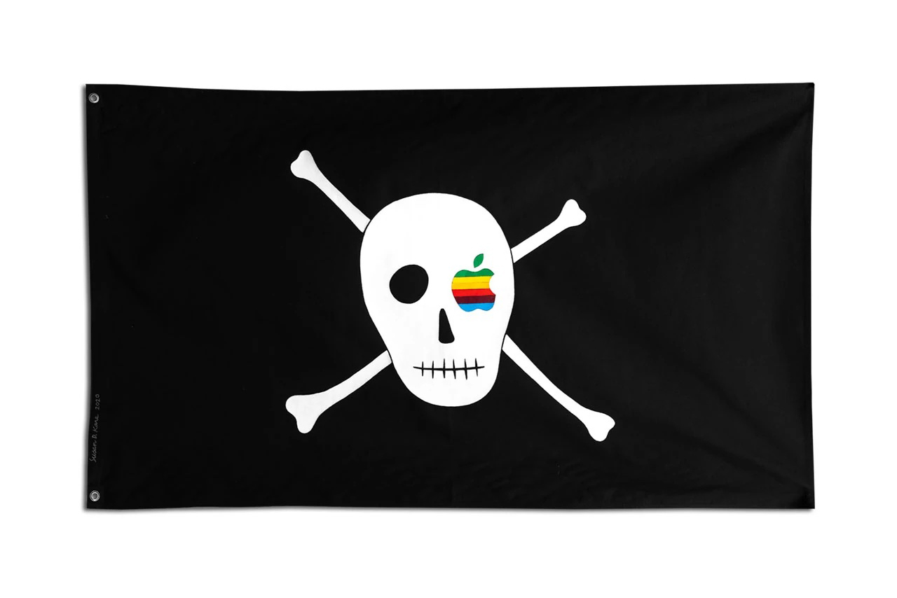
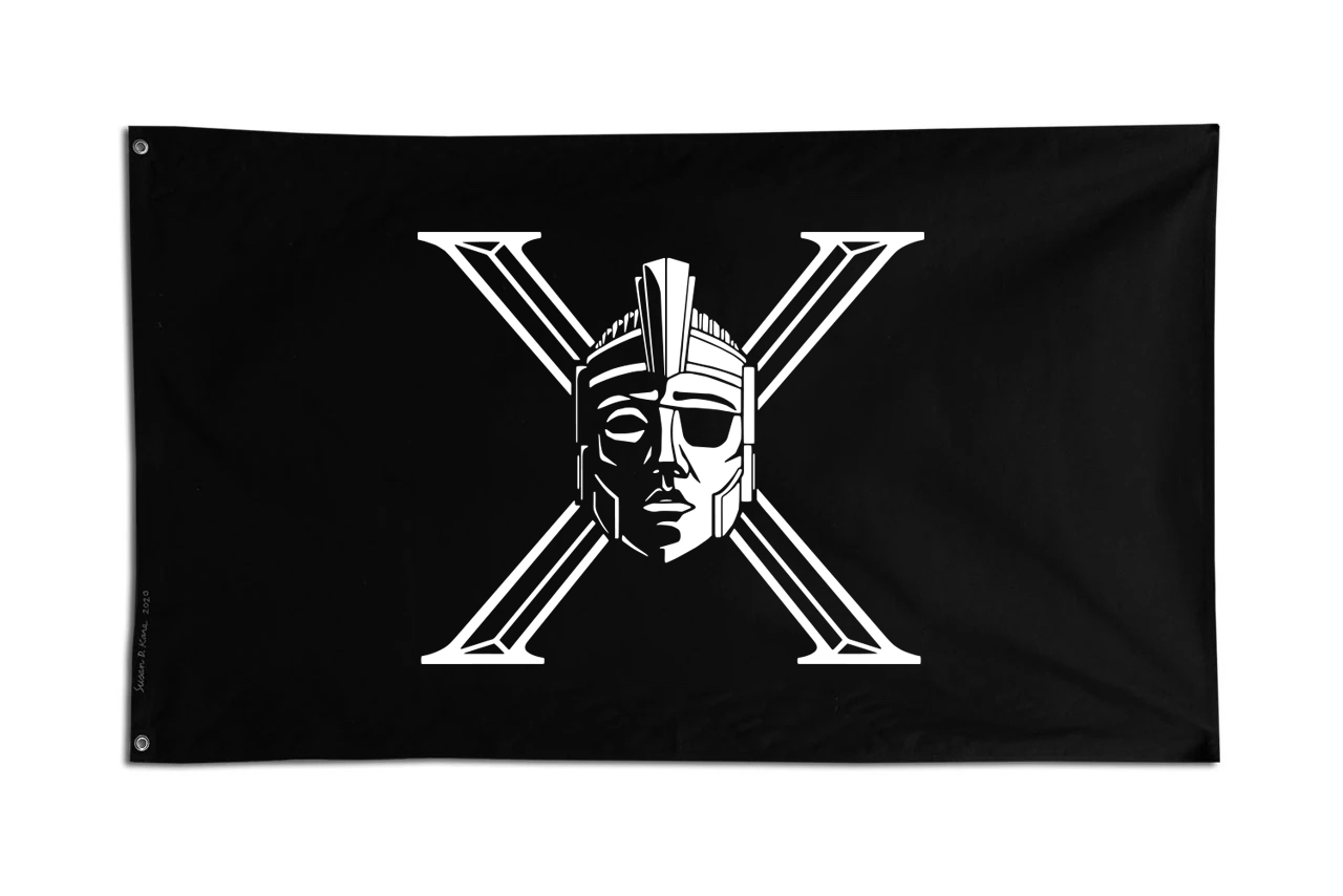
Apple, a company I often go to for design inspiration, famously used a modified Jolly Roger to commemorate the Mac team’s move into the new corporate headquarters in 1983. The team were affectionately known as the “pirates of Silicon Valley” and they enlisted the help of Susan Kare (who was originally responsible for many of the early user-interface elements of MacOS) to paint a skull and crossbones on a black piece of fabric with an eye-patch made from the Apple logo. I decided to take the X from the X-Series logo I designed, and used it to form the crossbones. We had also created an extremely unique piece of window hardware that was more akin to a hood ornament off a 1920’s luxury automobile. So, I took the head design of “The Icon,” as we called it, and had our illustrator Patrick simplify it into line art where I put it in place of the skull in front of the X to form our own skull and crossbones motif.
Curves für Immer! Concept
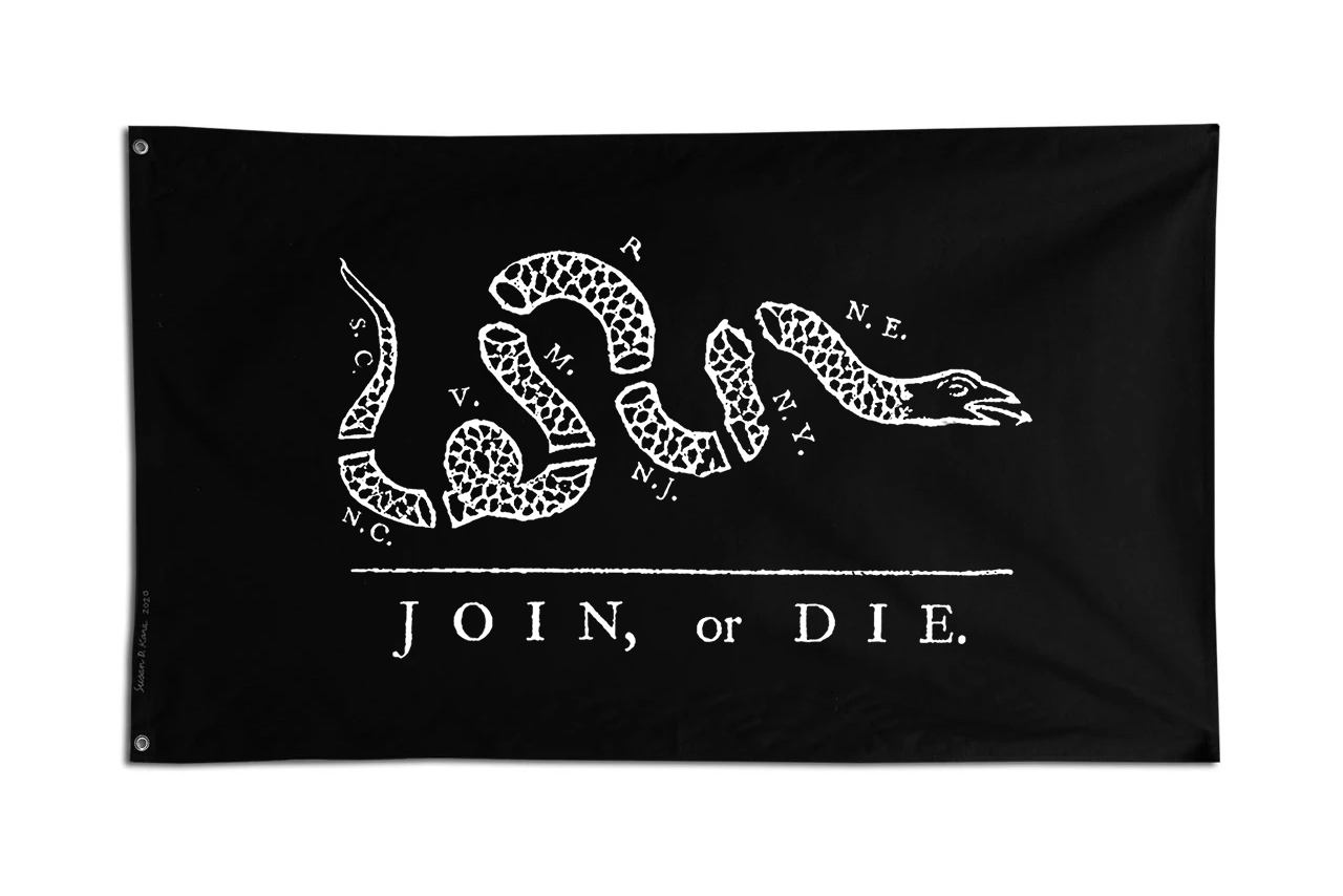
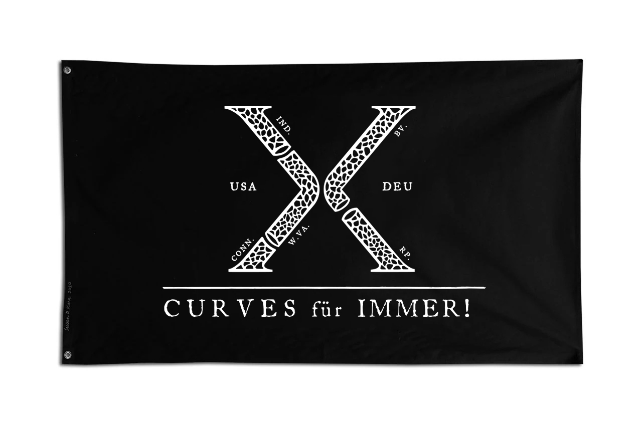
One of the most famous rally cries in history was the “Join or Die” graphic designed by Benjamin Franklin as a way to unite the colonies in the cause for independence. The graphic depicts eight segments of a snake, each representing a colony in a way that emphasizes the importance of colonial unity. It would later become a symbol for freedom in the Revolutionary War. I viewed the major companies that it would take to make X-Series a reality in a similar fashion. Independently, we were severed and would not achieve our goal. But, together, we could make this truly ground-breaking product a reality. I took the X-Series logo and had Patrick hand illustrate the scales and the segments, similar to the serpent in Franklin’s design. I broke the X into two major sections, symbolizing the two major countries of origin needed to pull this off, Germany and the United States. From there, each segment within the section was broken down by the headquarters of the major players involved in the project. Below it we inscribed the caption “Curves für Immer!,” which is an English/German hybrid phrase meaning “Curves Forever!;” a nod to X-Series’ curved design. I really loved how this concept came out, and we had this flag hanging proudly in our office as a daily reminder of what we were working towards.
