Apex Website
Project Description
In 2014 Apex was launching a new product (Insignia), a new literature design (The Portfolio) and an all new sales presentation (“A Better Way”), so it made sense to also include a major refresh to our website. We wanted to focus on interaction and education, but also add some new features that gave a more localized feel for Franchisees. At the time, Sony had recently released a product micro-site that introduced a new web experience now commonly known as a “parallax scroll” website. We loved how immersive the site was, and how they really let you explore their products in such an interactive way. After an exhaustive search, we partnered with The Basement, an interactive agency in Indianapolis, who were up for the challenge. Over the years the site has seen some upgrades with a major one happening in 2020 where we updated our Approach page with a more immersive experience. The site became instrumental in reinforcing the Apex business model and further legitimized a company that doesn’t advertise.
Work Performed
- Conceptual Design
- UI/UX
- Graphic Design
- CMS Integration
- Photography
- Video
Client
Apex Energy Group (Employee)
Parallax Product Page
We created a parallax concept that would let users explore various features and benefits of the Insignia window system in an interactive way. Scrolling down the page, you’re taken on an immersive journey exploring why Apex chose not to use wood in their products, the thermal performance of the glass package, and Insignia’s superior weather performance. We worked with our in-house animator at the time to storyboard and concept out the various scrolling interactions and transitions between sections and it was an amazing effort on The Basement’s part to nail the scroll engineering.


Stop Motion Concept
We still had two sections at the end that we weren’t sure how to handle with 3D animations; Choice and Perfect Fit. So, I came up with a concept where the window would rotate through all available color options and after a half rotation the window would then be grabbed by installers and walked up to an opening where it would be placed into the frame. I convinced our manufacturer to send a window sample in every color (interior and exterior) and I mapped out on a board each of the angles of rotation for the stop motion. Lastly, we built a wall (complete with siding) in the studio for the installers to set the window into. I was heavily inspired by the Old Spice “single-take” commercials of the day, and wanted to do a similar reveal on the wall. To pull this off we hung a white scrim from supports that was released as the installers walked the window up to the wall. This allowed us to do a nice transition from pure white into the Choice section and the installers setting the window lead us into the next final section. I am grateful for a CEO who believed in out-of-the-box ideas and even more grateful that my crazy idea worked!
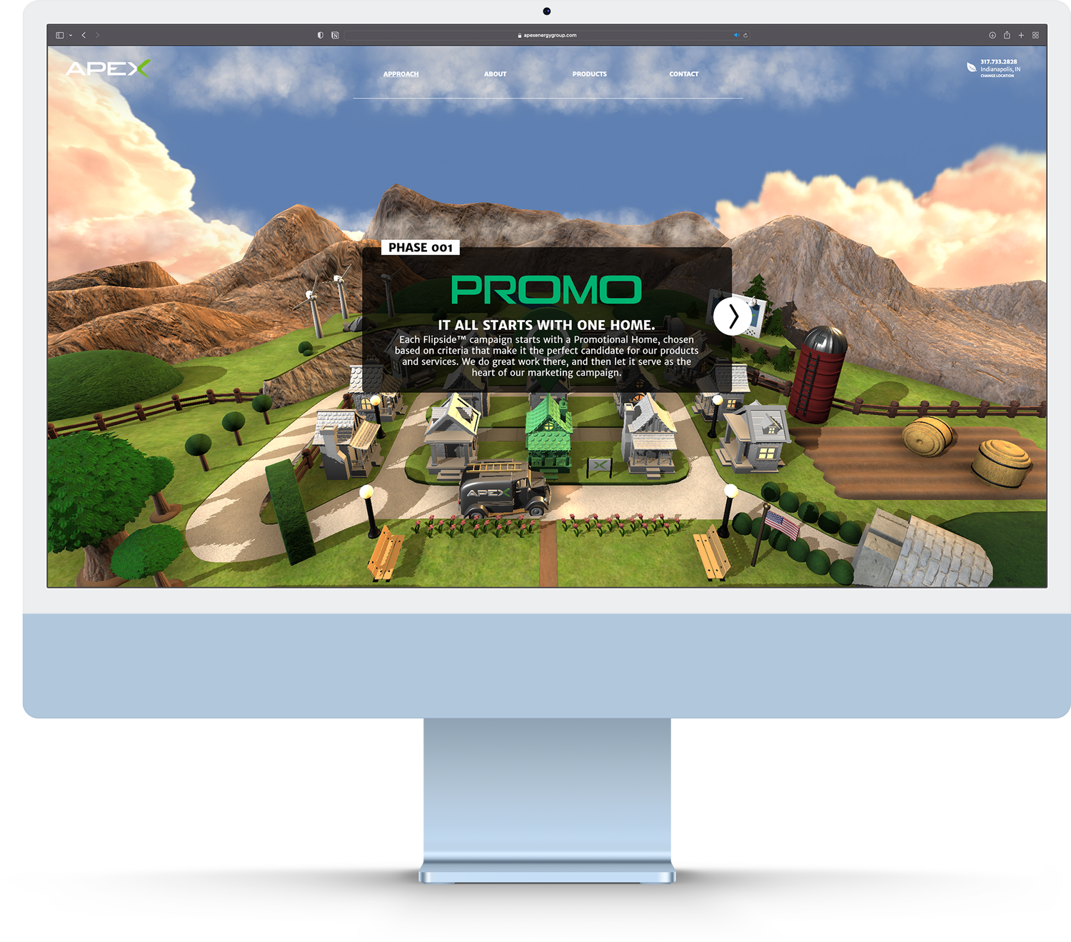
Updated Approach Page
In 2020, amidst the pandemic, Apex decided to double-down on their Flipside® direct-marketing approach. We did an updated insert at the door with some augmented reality interactivity and we wanted to cary that over into the web. So, we buckled down and created this webGL page element that lets you explore Apex’s approach with the same level of interactivity and immersion as the Product page. After exploring the three campaigns in the business model, you can scroll through the “why” and “how” of Apex’s approach. I did all the design work for these pages and two talented members of the team (Patrick Shaw and Taha Khan) brought it to life.
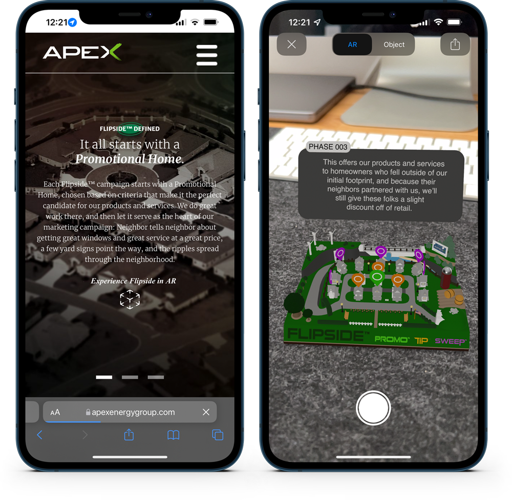
Pro-Tip: Load this page up on your iPhone and to explore Flipside® in AR.