

A Better Way App
Project Description
Apex had a reputation in the industry for creating innovative marketing approaches and tech-driven customer experiences. In the early days we had a non-linear application built for the desktop. Over the years, we took what we learned about interaction and started to build more captivating presentations for the iPad. But, in 2014 we decided to take what we had learned about immersion and created an entirely new presentation called “A Better Way;” with a primary focus on interactivity. I created a UI concept for the Home Screen that we later dubbed the “Cinematic User Interface,” where instead of using icons to enter each section of the presentation, the user could simply touch on an object in the scene to jump to that module. This allowed us to create an entire world where customers could take a hot air balloon journey to explore our company, products, and services in a more immersive way.
Work Performed
- UI/UX Design
- Conceptual Design
- Asset Creation
- CMS Integration
- SFX Design
- Implementation Specialist
Client
Apex Energy Group (Employee)
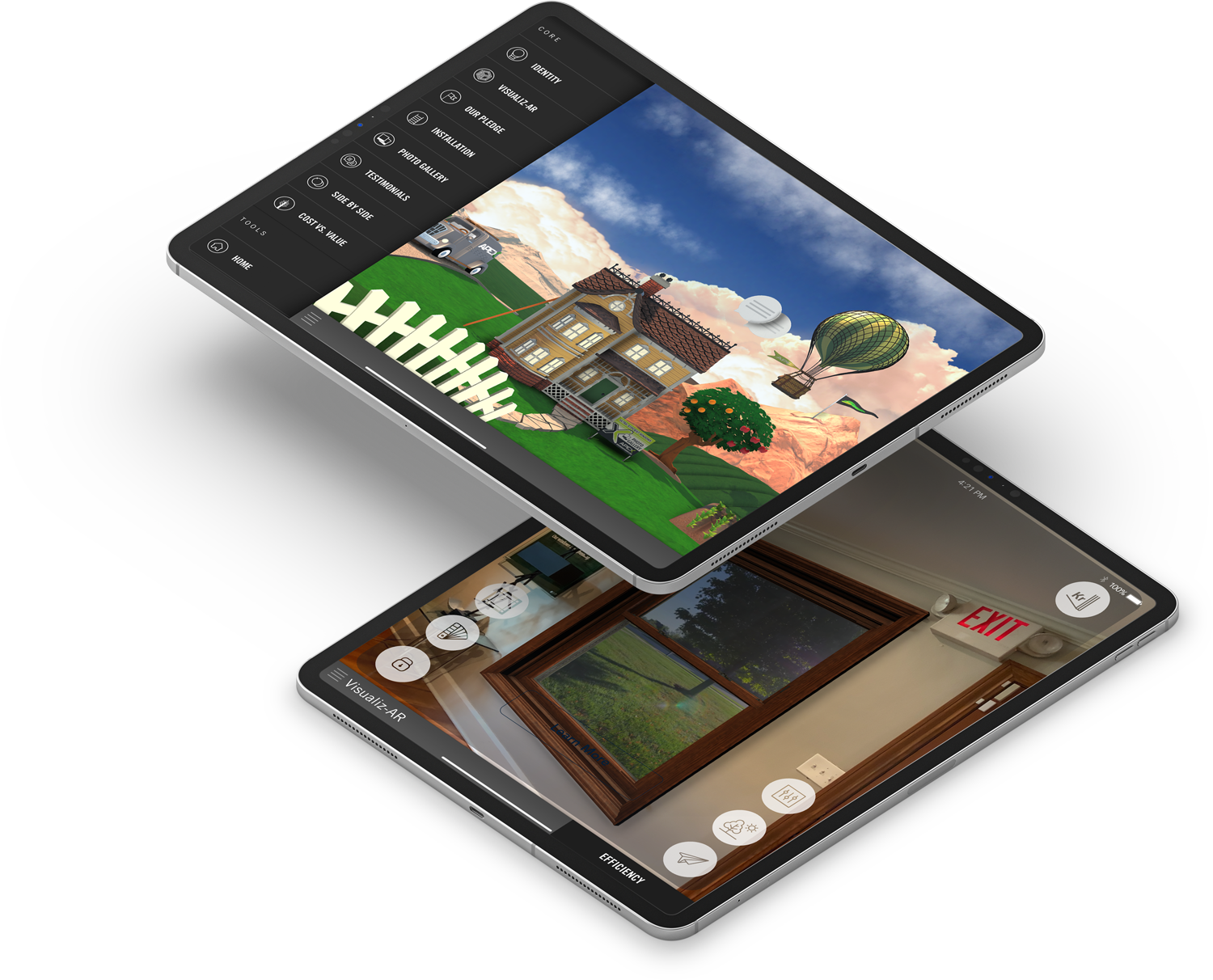
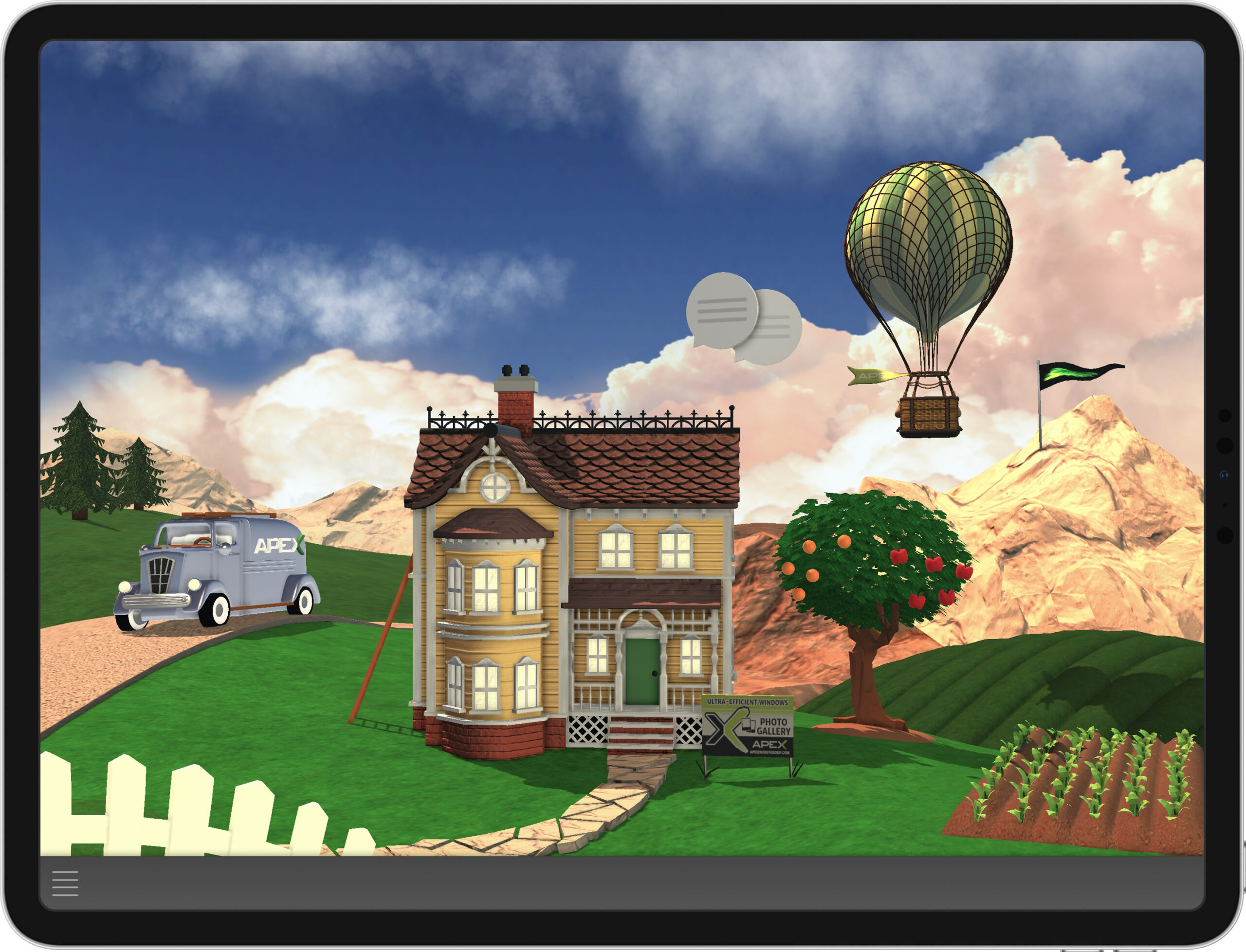
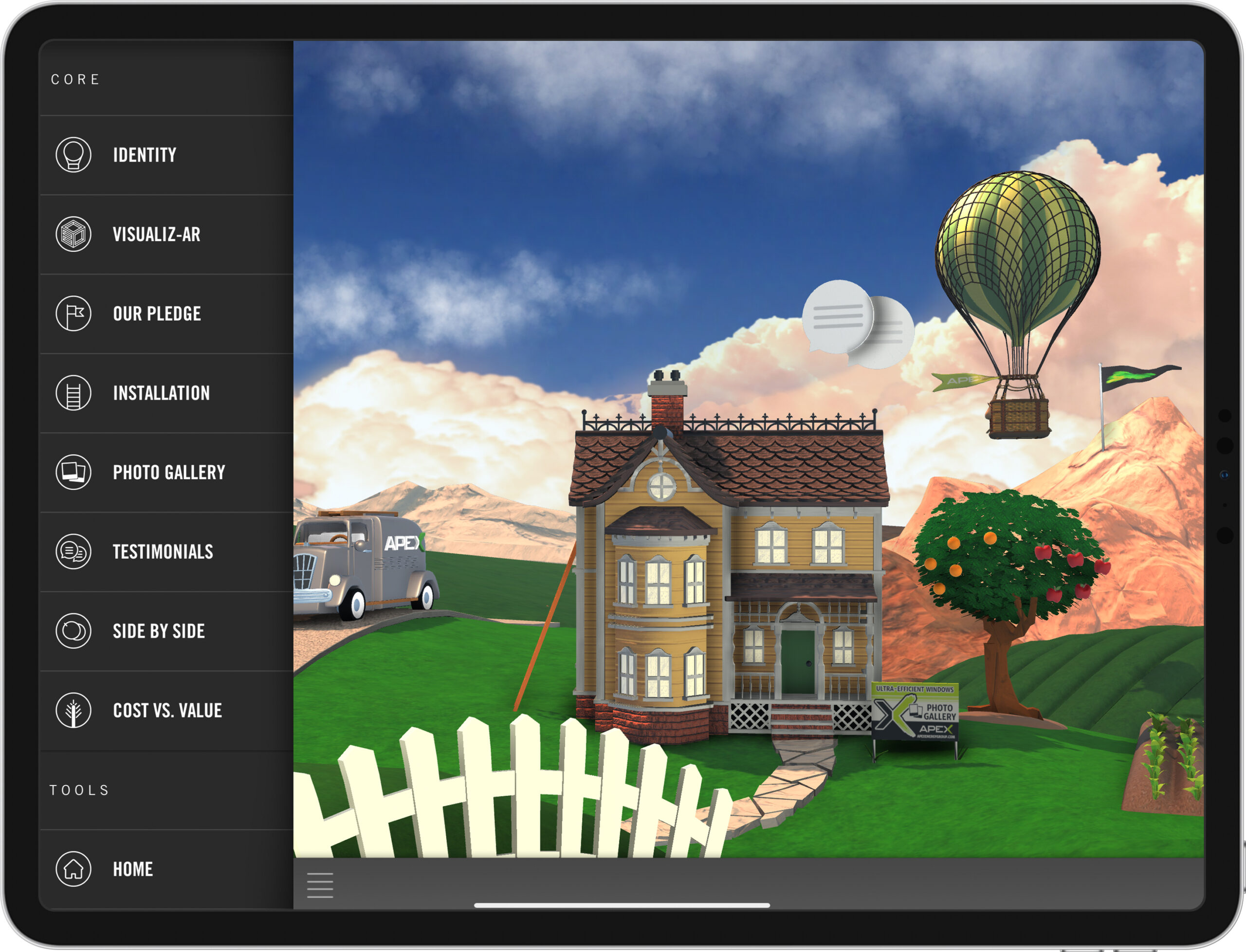
Cinematic User Interface
The cinematic user interface has been a staple of the ABW app over the years. The original version below had a more simplified geometry, with an almost paper-like quality to the shader materials. The refreshed 2019 release was updated to include more photo-realistic textures and lighting that were inspired by those found in some of Maxfield Parrish’s greatest works.

Wireframe Concepts
Here are some early wireframe concepts I created for the ABW application back in 2014. Here, I was trying to workout some of the user flows, the basic page elements and some of the key points of interaction.


Behind the Scenes
When we originally debuted the “A Better Way” application at our Apex Forum event in Orlando, I took some footage I shot during the making of the app and put together a little BTS video to highlight the process and some of the key players involved in the project.